Friday, 5 April 2013

Friday, 22 March 2013

Bar Code Generating Website

I used this website to design my bar code, I entered the number: 123456789123
Designing my Magazine

First of all I began with this image, I had to go stand outside of the college gates and take a continual group of photos with an extremely fast shutter speed. This image came out the best and using Photoshop I enhanced it to make it look bright as today is a very dull day.
I then began again, adding my first layer:
 |
| Add caption |
I used an empty layer and turned it purple, I did this because I extensively studied 'empire' film magazine, a magazine that unlike in my first year where I learnt to use the white background, I used a purple background. On top of this image I added my digital imaging of the cloud. Then by scaling the image I made them the same A4 size.

I then turned up the saturation of the image, I did this because it made the clouds lose the texture of being a cloud, but it created a pattern in the background ready for my to edit my magazine front cover. I zoomed in to the image of the cloud, particularly into the gaps in the cloud so it would create a paint brush effect.
I did this because I felt it looked much more effective than just the purple background:


As you can see through looking at both of the images, adding a texture to the background looks much more appealing and like a magazine that would be expected to cost £4.
the image was taken from a photoshoot in the green room at college, using the white background I took several image of my actor.
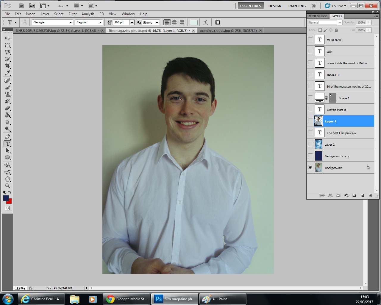
My favorite of which is this one below because of the angle it was taken and also because of the hand movements, very similar to that of Robert Downey Junior on the cover of Empire.

I then added the masthead, 'insight' magazine sounded much better than the original idea of 'cloud' magazine. Although cloud magazine was found on a synonym checker, I felt that insight was much more eye-catching.
However, I had to make a change because I did not want these letters in front of the image:


I then added text above the masthead which is there to entice the reader to buy this magazine. when doing research not all film magazines use this, it is no longer a convention, however, I felt it appropriate to make sure I have one. Total Film however, using a minimalistic approach, which means they use their main image to entice the audience with barely any text.

Part of the brief stated that this magazine would have to include our film trailer, so to be specific I put not only my actor on the front cover, but also by naming him on the front cover. I used black font to stand out on his shirt.

I then added an advertisement bubble, this was made to put information inside.

The information I made to be put inside this bubble is information that says 'The most watched films of 2013'. This is used to help the audience know what to buy and what they want. It is almost half way through the year and getting people to buy such films is a tactic used by the distribution companies.

I then added text at either side of the model.

After adding text to the right of the screen, I then turned the opacity down on the text so that it is not as vibrant as the text above. I used the colour white to stay contrasting with the main image.


I then added text to the left of the screen, this was to make the empty spaces dissapear, looking at film magazines that used texts, I found that they would have minimal gaps around the main image. using Empire magazine as an example, they have no gaps at all, including images as well as text.
I chose not to include images because I felt it would have too much too look at.
Along with this I also included a bar code, the bar code is essential when the consumer is buying the film magazine.

Poster in Action

Using an image I took at Kingston Retail Park, I have edited using Adobe Photoshop to make it look like my image has being adapted to real life.
This is the correct shaping of my image, and I feel that it is effective putting it on a bus stop, I feel that I have successfully created a poster for a film trailer.
Audience Feedback Forms Designed
Evaluation in for after easter, so I have spent my afternoon designing audience feedback forms and asking questions about my finished film trailer.

I have asked all of the questions that are relevant to the aims of my task.

I have asked all of the questions that are relevant to the aims of my task.
Tuesday, 19 March 2013
Scenes Shot
- interview with Steve talking about his fear.
- scenes of him being unable to sleep
- stood asleep in front of the camera
- him as a child (using actor Jacob Kell) seeing his mothers death
- scenes of him being unable to sleep
- stood asleep in front of the camera
- him as a child (using actor Jacob Kell) seeing his mothers death
Subscribe to:
Posts (Atom)