
Friday, 22 March 2013
Bar Code Generating Website

I used this website to design my bar code, I entered the number: 123456789123
Designing my Magazine

First of all I began with this image, I had to go stand outside of the college gates and take a continual group of photos with an extremely fast shutter speed. This image came out the best and using Photoshop I enhanced it to make it look bright as today is a very dull day.
I then began again, adding my first layer:
 |
| Add caption |
I used an empty layer and turned it purple, I did this because I extensively studied 'empire' film magazine, a magazine that unlike in my first year where I learnt to use the white background, I used a purple background. On top of this image I added my digital imaging of the cloud. Then by scaling the image I made them the same A4 size.

I then turned up the saturation of the image, I did this because it made the clouds lose the texture of being a cloud, but it created a pattern in the background ready for my to edit my magazine front cover. I zoomed in to the image of the cloud, particularly into the gaps in the cloud so it would create a paint brush effect.
I did this because I felt it looked much more effective than just the purple background:


As you can see through looking at both of the images, adding a texture to the background looks much more appealing and like a magazine that would be expected to cost £4.
the image was taken from a photoshoot in the green room at college, using the white background I took several image of my actor.
My favorite of which is this one below because of the angle it was taken and also because of the hand movements, very similar to that of Robert Downey Junior on the cover of Empire.

I then added the masthead, 'insight' magazine sounded much better than the original idea of 'cloud' magazine. Although cloud magazine was found on a synonym checker, I felt that insight was much more eye-catching.
However, I had to make a change because I did not want these letters in front of the image:


I then added text above the masthead which is there to entice the reader to buy this magazine. when doing research not all film magazines use this, it is no longer a convention, however, I felt it appropriate to make sure I have one. Total Film however, using a minimalistic approach, which means they use their main image to entice the audience with barely any text.

Part of the brief stated that this magazine would have to include our film trailer, so to be specific I put not only my actor on the front cover, but also by naming him on the front cover. I used black font to stand out on his shirt.

I then added an advertisement bubble, this was made to put information inside.

The information I made to be put inside this bubble is information that says 'The most watched films of 2013'. This is used to help the audience know what to buy and what they want. It is almost half way through the year and getting people to buy such films is a tactic used by the distribution companies.

I then added text at either side of the model.

After adding text to the right of the screen, I then turned the opacity down on the text so that it is not as vibrant as the text above. I used the colour white to stay contrasting with the main image.


I then added text to the left of the screen, this was to make the empty spaces dissapear, looking at film magazines that used texts, I found that they would have minimal gaps around the main image. using Empire magazine as an example, they have no gaps at all, including images as well as text.
I chose not to include images because I felt it would have too much too look at.
Along with this I also included a bar code, the bar code is essential when the consumer is buying the film magazine.

Poster in Action

Using an image I took at Kingston Retail Park, I have edited using Adobe Photoshop to make it look like my image has being adapted to real life.
This is the correct shaping of my image, and I feel that it is effective putting it on a bus stop, I feel that I have successfully created a poster for a film trailer.
Audience Feedback Forms Designed
Evaluation in for after easter, so I have spent my afternoon designing audience feedback forms and asking questions about my finished film trailer.

I have asked all of the questions that are relevant to the aims of my task.

I have asked all of the questions that are relevant to the aims of my task.
Tuesday, 19 March 2013
Scenes Shot
- interview with Steve talking about his fear.
- scenes of him being unable to sleep
- stood asleep in front of the camera
- him as a child (using actor Jacob Kell) seeing his mothers death
- scenes of him being unable to sleep
- stood asleep in front of the camera
- him as a child (using actor Jacob Kell) seeing his mothers death
Building the magazine

A thesaurus was used to help me come together to choose my film name, this meant that I could have something in the background as I put my image together.
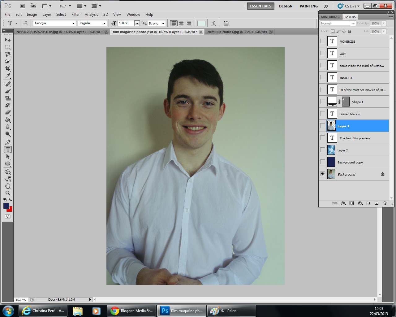
My chosen image:

I chose this image because of the smile and also the angle of his body, I felt it was very similar to other magazines I had analysed and therefore I achieved the aim of my photoshoot.


Thursday, 14 March 2013

Poster Production
Focusing on the word 'Within', and moving away from my original stimulus of Paranormal Activity has changed into an original idea following more and more research into my sub-genre theme of super natural.

I began by adding my photo to Photoshop my photo was taken during the filming of my film trailer, this is an image from the trailer itself. The hand coming onto his mouth is him being silenced, but also an image of him keeping the devil within him, because it is desperate to escape - he is been possessed.

I then used a photo I had take in the local Forrest, over the county road flyover, Hull. I did not need permission to take these photos, however, I did have to make sure I took them during the day to get the correct lighting for the shoot.

I added my image to photoshop, focusing on one tree in particular that is very think and 'spiny'. I felt that this coming up through the image is very clever and connotes the split in his new found personality. In order to change this photo into this effect, I used the 'filter' button, and then the artistic, and then the 'brush strokes'. This made the photo become very dark and mysterious, although it is very clear what is set within the scene, it is very different to the original image. This differs from the original white background that the photo has.

To make sure this photo could be seen, I went onto my image of my actor, and using the rubber tool, I faded the edge of the image to make sure that the forestry could be seen clearly. I did this by carefully zooming in on the image and cutting out the white that was in the original photo. I felt this was much better than looking at the original image.

To achieve this, I made sure that this layer could be seen above the layer of the Forrest I then changed it to the 'linear light' opacity. This made the image clear however I was still unhappy with it, the connotations of green are too happy and I felt that it was unnatural for this image to be shown in a super natural trailer.
Although, I did feel very happy with the achievement of the tree running directly down the centre of his nose.

In order to get the image darker, I had to make the 'background' layer shown to the specatator, having this turn up made the image become darker and the face become red however the other half become see through.
This was the idea I had planned in my image because it showed the two sides to his personality, the devil within alongside the person that he still is.
 After I was happy with my image I added text to it, with the film being called 'Within' it was hard to choose a text font. So I decided to add the 'Lithos Pro' font in block white so it could be seen across the whole image. I then had to change the opacity so it didn't stand out too much. I changed the opacity, to 57.
I then added my name to the image, showing it as directed by me personally in red writing and above 'Within'. I had to also turn down the opacity of this writing to make sure it then didn't stand out too much but would stick in with this text. Below, I am very content with this poster and feel I am ready to move on to my film trailer magazine.
After this image I decided to get rid of the text that said 'Directed by Bethany Hirons' because I didn't feel it was appropriate.

I added the date tthat the film will be produced, which is the 32.06.12, and I also chose to add names under the text, I did this by adding text layers to the image and stacking them as appropriate. I also chose to use names of friends as standard text so it ticks all of the boxes of what is done in the posters that I looked into.
Editing Day 1
First of all I named all of my images, this makes it easier for my to know which ones in will be used for what.
Then I added text, after making the decision to call myself 'within' due to the satanic references, I had to choose the correct fonts to use...
The edit suite has limited font use, however I have decided to go with "GungsuhChe" font size 354.0 for Within.

I then placed it onto the timeline so that the word 'Presenting' would appear before 'Within', I did this by copying and pasting the text format and on one of them deleting the word within, so that it wouldn't look so blocky on the screen. I then changed it to a red font, I felt that this is a very effective technique as it symbolise the blood.

I then added clip MAH00343 however it was shot like this:

In order to get around this problem I turned up the scale to 150.0 through the video effects and it became full screen. The shot is my character Steve walking into his house, as seen in my location shots it is an old fashioned house,it is a shot that lasts 3 seconds before cutting to a review from the Guardian website likening it to Blair Witch Project. The reason I have chosen the Guardian is because its views on film are known across the industry.

Again I have chosen to use the red font to show the blood but also links to the satonic themes.
Then I added text, after making the decision to call myself 'within' due to the satanic references, I had to choose the correct fonts to use...
The edit suite has limited font use, however I have decided to go with "GungsuhChe" font size 354.0 for Within.
I then placed it onto the timeline so that the word 'Presenting' would appear before 'Within', I did this by copying and pasting the text format and on one of them deleting the word within, so that it wouldn't look so blocky on the screen. I then changed it to a red font, I felt that this is a very effective technique as it symbolise the blood.
I then added clip MAH00343 however it was shot like this:
In order to get around this problem I turned up the scale to 150.0 through the video effects and it became full screen. The shot is my character Steve walking into his house, as seen in my location shots it is an old fashioned house,it is a shot that lasts 3 seconds before cutting to a review from the Guardian website likening it to Blair Witch Project. The reason I have chosen the Guardian is because its views on film are known across the industry.
Again I have chosen to use the red font to show the blood but also links to the satonic themes.
Wednesday, 13 March 2013
Film Poster Drafts
Draft 1:

Using lighting as the key, making some of it appear lighter to the right hand side, and darkness on the left to show that he is being possessed. I used the dark stroke texture, on Photoshop and added minimal text, I am very happy with the colors that I have used, however, I am not sure about the first image.
Draft 2:


After looking into my first image again, I then looked back onto my analysis and decided as I have chosen to use techniques from Paranormal Activity whilst incorporating Blair Witch Project, I would try to use a poster like theirs.
Paranormal Activity uses the technique of text and quotes over the main image, I am choosing to also use this technique meaning that my images above need to be altered slightly. The texts used in this image bring more fear into the audience than the image itself as it helps to understand what is going on.

 The process began with adding a black background in front of the altered image, then adding the name of the film below, although the problem I discovered was my image was too wide, and therefore needs to be shorted otherwise I will not be allowed to add as many quotes as was in the paranormal activity one.
Next I decided to make the image smaller so that there is more room for quotes, I did this by using the transform + scale buttons to make my image stretch.
Another technique I used was using the works within, and keeping the 'i's in lower case, so I could use the satanic symbol for dots, however, through audience feedback I have found that it is not clear that I was trying to do that and through the next edit I will have to make it more clear.
Another technique is the use of the quote from my imagined film, making it even more obvious that there will be links to the devil in my film, this is also made clear within the trailer, however, the poster is what entices people to watch the trailer.
Subscribe to:
Posts (Atom)