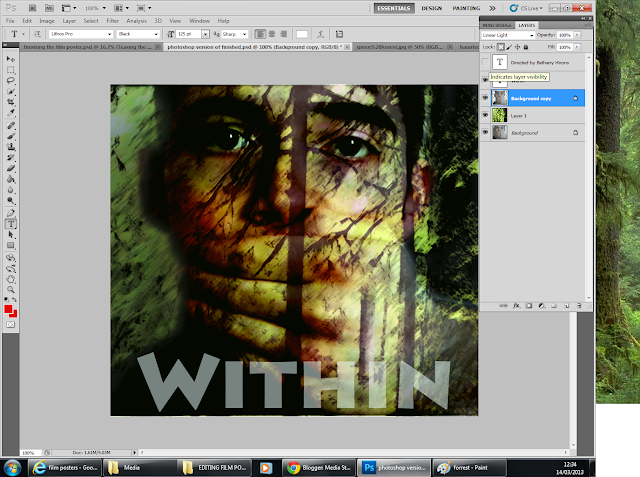
Focusing on the word 'Within', and moving away from my original stimulus of Paranormal Activity has changed into an original idea following more and more research into my sub-genre theme of super natural.
I began by adding my photo to Photoshop my photo was taken during the filming of my film trailer, this is an image from the trailer itself. The hand coming onto his mouth is him being silenced, but also an image of him keeping the devil within him, because it is desperate to escape - he is been possessed.
I then used a photo I had take in the local Forrest, over the county road flyover, Hull. I did not need permission to take these photos, however, I did have to make sure I took them during the day to get the correct lighting for the shoot.
I added my image to photoshop, focusing on one tree in particular that is very think and 'spiny'. I felt that this coming up through the image is very clever and connotes the split in his new found personality. In order to change this photo into this effect, I used the 'filter' button, and then the artistic, and then the 'brush strokes'. This made the photo become very dark and mysterious, although it is very clear what is set within the scene, it is very different to the original image. This differs from the original white background that the photo has.
To make sure this photo could be seen, I went onto my image of my actor, and using the rubber tool, I faded the edge of the image to make sure that the forestry could be seen clearly. I did this by carefully zooming in on the image and cutting out the white that was in the original photo. I felt this was much better than looking at the original image.
To achieve this, I made sure that this layer could be seen above the layer of the Forrest I then changed it to the 'linear light' opacity. This made the image clear however I was still unhappy with it, the connotations of green are too happy and I felt that it was unnatural for this image to be shown in a super natural trailer.
Although, I did feel very happy with the achievement of the tree running directly down the centre of his nose.
In order to get the image darker, I had to make the 'background' layer shown to the specatator, having this turn up made the image become darker and the face become red however the other half become see through.
This was the idea I had planned in my image because it showed the two sides to his personality, the devil within alongside the person that he still is.
 After I was happy with my image I added text to it, with the film being called 'Within' it was hard to choose a text font. So I decided to add the 'Lithos Pro' font in block white so it could be seen across the whole image. I then had to change the opacity so it didn't stand out too much. I changed the opacity, to 57.
I then added my name to the image, showing it as directed by me personally in red writing and above 'Within'. I had to also turn down the opacity of this writing to make sure it then didn't stand out too much but would stick in with this text. Below, I am very content with this poster and feel I am ready to move on to my film trailer magazine.
After this image I decided to get rid of the text that said 'Directed by Bethany Hirons' because I didn't feel it was appropriate.
I added the date tthat the film will be produced, which is the 32.06.12, and I also chose to add names under the text, I did this by adding text layers to the image and stacking them as appropriate. I also chose to use names of friends as standard text so it ticks all of the boxes of what is done in the posters that I looked into.


No comments:
Post a Comment